

Mapping Samples
Troyer Advisors creates supply and demand mapping that makes it crystal clear - where you should be and where you should not be.
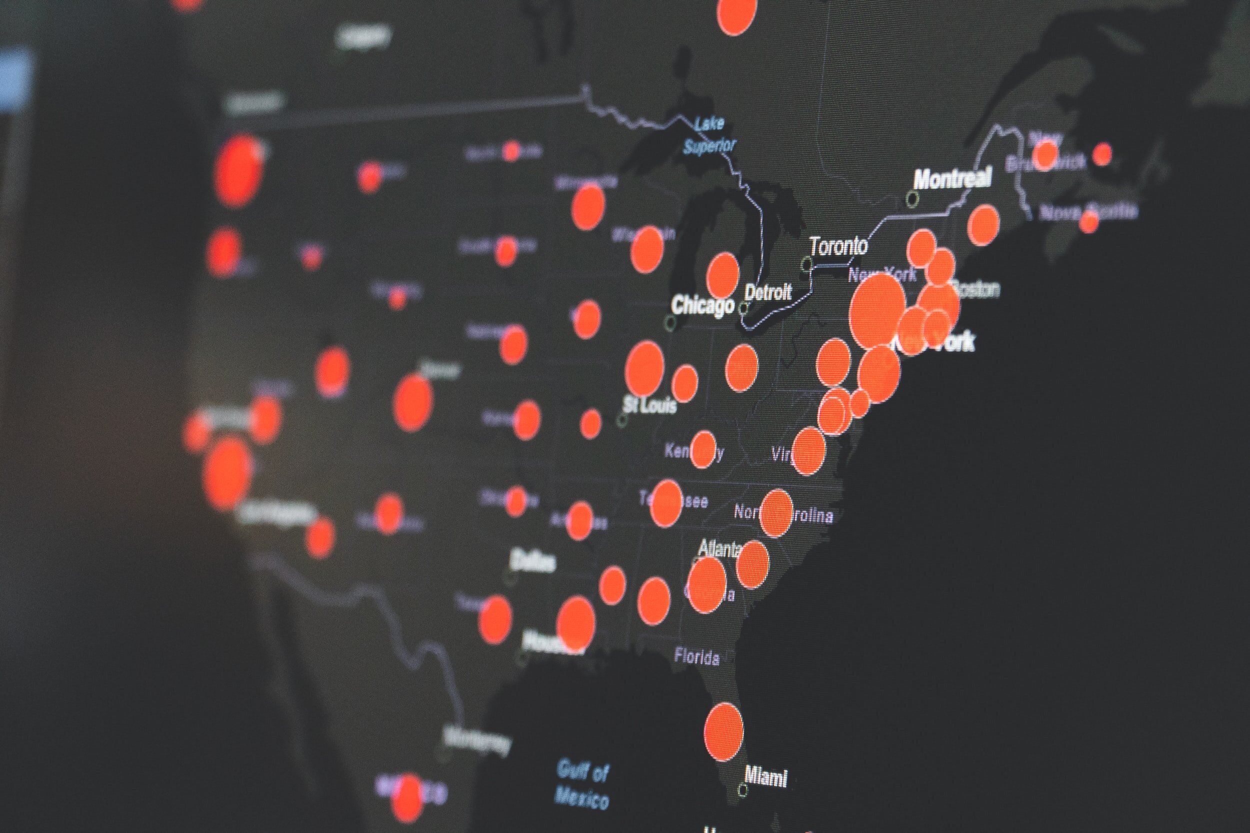
Typically, our maps show the data represented in eight equal quantiles across the nation. For example, every red zip code would indicate the top 12.5% of the whole United States. The Sample Maps below represent the data in eight equal quantiles but only for the state of Wyoming.
Sample 1:
This map displays the density of Age and Income Qualified Seniors in Wyoming by zip code with the current supply of Skilled Nursing Facilities.
Sample 2:
This map displays the density of Age and Income Qualified Adult Children in Wyoming by zip code with the current supply of Assisted Living beds displayed at each facility’s physical address.
Sample 3:
This map displays Median Housing Value in Wyoming by zip code with the current supply of Home Health Agencies.